primarySwatch를 사용하여 색상 적용 MaterialApp의 theme 설정시 primarySwatch를 사용하면, 원하는 색상으로 변경할 수 있다. @override Widget build(BuildContext context) { return MaterialApp( home: const HomePage(), theme: ThemeData( primarySwatch: Colors.orange ), ); } 커스텀 색상 적용 하지만, Material 라이브러리에 정의된 색상만 사용하지 않고, 커스텀한 색상을 적용하려면 아래와 같이 직업 입력해줄 수 있다. 하지만 색상을 하나씩 지정해줘야하는 번거로움이 있다. @override Widget build(BuildContext context) { re..
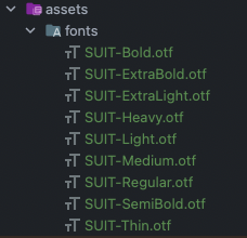
MaterialApp의 theme를 사용하여 앱 전체 폰트 스타일을 변경할 수 있다. 프로젝트에 폰트 추가 폰트를 사용하기 전에 프로젝트에 추가를 해주는 작업이 필요하다. 우선, 사용할 폰트를 다운로드한 뒤에 프로젝트 root 경로에 assets/fonts/ 디렉토리를 생성해준다. 본 글에서는 SUIT 폰트를 사용한다. https://sunn.us/suit/ S U N N sunn.us otf 파일을 다운로드하여 아래와 같이 assets/fonts/디렉토리에 추가한다. pubspec.yaml에 아래와 같이 폰트를 추가한다. fonts > family: 폰트 이름 fonts > fonts: font weight에 따라 보여줄 폰트 파일을 매핑 flutter: # ... fonts: - family: SUI..
styled-components 의존성 설치 styled-component를 사용하기 위해 styled-components와 @type/styled-components 를 의존서에 추가해야 한다. # with npm npm install --save styled-components # with yarn yarn add styled-components javacript에서 사용한다면 문제는 없지만, typescript에서 오류없이 사용하기 위해서는 styled-component의 type들을 가지고 와야한다. # with npm npm i --save-dev @types/styled-components # with yarn yatn add --dev @types/styled-components 첫 styl..