styled-components 의존성 설치
styled-component를 사용하기 위해 styled-components와 @type/styled-components 를 의존서에 추가해야 한다.
# with npm
npm install --save styled-components

# with yarn
yarn add styled-components
javacript에서 사용한다면 문제는 없지만, typescript에서 오류없이 사용하기 위해서는 styled-component의 type들을 가지고 와야한다.
# with npm
npm i --save-dev @types/styled-components

# with yarn
yatn add --dev @types/styled-components
첫 styled component 생성
명명규칙이나 디렉토리 구조는 개발자마다 다르게 구성하기 때문에, 본 글에서는 이와 관련된 내용은 살펴보지 않는다.
styled 컴포넌트를 생성하기 위해서는 우선 styled 를 import해야 한다.
import styled from 'styled-components';
그리고 생성할 document element를 선택한다. 여기서는 버튼을 생성하기위해 styled.button으로 컴포넌트를 생성했다.
- styled.<DOM element> (예시: styled.div, styled.span, styled.a 등등)
const StyledButton = styled.button``;
그리고, css 를 작성하듯이 스타일을 추가하여 export하면 다른 React 컴포넌트에서 사용할 수 있다.
// StyledButton.tsx
import styled from 'styled-components';

const StyledButton = styled.button`
    background-color: #228be6;
    color: #ffffff;
    border: none;
    border-radius: 5px;
    padding: 12px 24px;
    margin: 0;
`;

export default StyledButton;
Button 컴포넌트를 생성하여 방금 생성한 styled-component를 import하여 사용하면,
// Button.tsx
import React, { FC } from 'react';
import { ButtonProps } from './types';
import StyledButton from './StyledButton';

const Button: FC<ButtonProps> = () => {
    return <StyledButton>Click me!</StyledButton>;
};

export default Button;
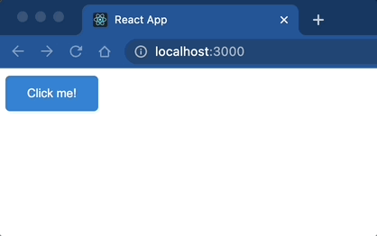
아래와 같이 작성한 css 스타일이 적용되어 화면에 보여진다.
styled component에 props 넘기기
만약, props를 넘겨서 값에 따라 스타일을 바꿔주고 싶은 경우, ${(props) => props.name} 형태로 prop를 받아 올 수 있다.
// StyledButton.tsx
import styled from 'styled-components';

const backgroundColor = {
    primary: '#1c7ed6',
    secondary: '#ae3ec9',
};

const hoverBackgroundColor = {
    primary: '#1971c2',
    secondary: '#9c36b5',
};

interface StyledButtonProps {
    readonly variant: 'primary' | 'secondary';
}

const StyledButton = styled.button<StyledButtonProps>`
    background-color: ${(props) => backgroundColor[props.variant]};
    color: #ffffff;
    border: none;
    border-radius: 5px;
    padding: 12px 24px;
    margin: 0;
    cursor: pointer;
    transition: 0.1s background-color ease-in-out;

    &:hover {
        background-color: ${(props) => hoverBackgroundColor[props.variant]};
    }
`;

export default StyledButton;
// Button.tsx
import React, { FC } from 'react';
import { ButtonProps } from './types';
import StyledButton from './StyledButton';

const Button: FC<ButtonProps> = ({ variant = 'primary' }) => {
    return <StyledButton variant={variant}>Click me!</StyledButton>;
};

export default Button;
props 값에 따라 아래와 같이 색상이 다른 버튼을 생성 할 수 있다.

styled component 상속
기존에 만든 styled component를 상속받아서 사용할 수 있다.
styled(styled컴포넌트) 와 같이 styled의 첫번째 인자로 상속 받을 styled component를 넣어줄 수 있다. 그러면 상속 받은 컴포넌트의 스타일에 override하여 일부 스타일을 변경할 수 있다.
// ...

const StyledButton = styled.button<StyledButtonProps>`
	// ...
`;

export const StyledRoundButton = styled(StyledButton)`
    border-radius: 24px;
`;

theme
theme를 정의하여 사용할 수 도 있다. styled-components는 ThemeProvider를 제공하여 하위 styled component에 정의한 theme를 부여할 수 있다.
light theme와 drak theme의 스타일을 정의한다.
- value 는 현재 테마가 어떤 테마인지(light 인지, dark인지) 확인하기 위한 용도로 사용
const lightTheme = {
    value: 'light',
    style: {
        backgroundColor: '#ffffff',
        color: '#343a40',
    },
};

const darkTheme = {
    value: 'dark',
    style: {
        backgroundColor: '#343a40',
        color: '#ffffff',
    },
};
그리고, 상위에 ThemeProvider로 감싸고, light theme를 default 값으로 하여 state 값을 생성한다.
ThemeProvider의 theme 속성에 state값을 부여한다.
그리고, 테마를 변경해줄 버튼 클릭 이벤트 핸들러를 생성하여 테마를 토글(toggle) 할 수 있도록 한다.
function App() {
    const [theme, setTheme] = useState(lightTheme);

    const toggleTheme = () => setTheme(theme.value === 'light' ? darkTheme : lightTheme);

    return (
        <ThemeProvider theme={theme}>
            <StyledLayout>
                <Button variant="primary" onClick={toggleTheme}>
                    Toggle Theme
                </Button>
                <Button variant="primary">Click Me!</Button>
                <Button variant="secondary">Click Me!</Button>
                <h1>Hello!</h1>
            </StyledLayout>
        </ThemeProvider>
    );
}
그리고 ThemeProvider에 의해 styled component의 props로 theme 값이 넘어온다. 넘어온 theme 값에서 스타일을 가지고 온 다음 적용한다.
export const StyledLayout = styled.div`
    height: 100vh;
    padding: 12px;
    background-color: ${({ theme }) => theme.style.backgroundColor};
    color: ${({ theme }) => theme.style.color};
`;
아래와 같이 토글 버튼을 누를때마다 테마가 변경이 되는것을 볼 수 있다.

Reference
https://styled-components.com/
styled-components
Visual primitives for the component age. Use the best bits of ES6 and CSS to style your apps without stress 💅🏾
styled-components.com
'Frontend > React' 카테고리의 다른 글
| Rollup 모듈에서 Cannot read properties of null (reading 'useState') 오류 조치 (0) | 2022.07.26 |
|---|---|
| rollup을 이용하여 react 모듈 만들기 (yarn berry, babel) (0) | 2022.07.11 |
| 기존 React App에 Typescript 적용하기 (0) | 2022.03.02 |
| React 프로젝트 npm에 배포하기 (0) | 2022.01.06 |
| babel, webpack 으로 react 프로젝트 생성하기 (0) | 2022.01.06 |